Login
Registered users

From the handcrafted details, such as wooden bevels and custom-made lamps, to the material complexity, which enriches the wooden surfaces with marble inserts and brass details, everything in the Leo Goudvisch Bar in Amsterdam aims to recreate an environment with modern charm and a layer of nostalgia. The cultural mosaic that characterizes the Dutch capital is captured in the interiors of the space, the latest opening of the group of cocktail bars known as The Goudvisch Family.
The ability to evoke such pure and direct emotions, rooted in meticulous and passionate design research, is the trademark of Studio Modijefsky. Founded in 2009 by Esther Stam, this interior design studio headquartered in Amsterdam currently features a young, entirely female team, although Stam clarified that “men are also welcome, as long as they are talented designers”. Specializing in the hospitality sector, Studio Modijefsky also works on residences, offices, museums, and wellness centers in the Netherlands and abroad, with a design approach that starts with an analysis of the context to develop a language that is tailor-made for each space.
Inaugurated at the beginning of summer, the Leo Goudvisch Bar stands on Beukenplain, on the eastern side of the city, and extends over the lively square with a welcoming outdoor terrace. The interiors of the bistro were designed experimenting with a real patchwork of materials that revolve around wood as the main choice, thus recalling the ambiance of bruin cafés, typical Amsterdam eateries, and transplanting contemporary allure into this old-time atmosphere. Wood, selected in walnut for the wall paneling and oak for the furniture, is flanked by intense, Burgundy-colored marble with light veins, brass with an antique finish, and terrazzo, the studio’s favorite material, which plays on shades of white and black in two complementary versions, in which one prevails over the other and vice versa.
The centerpiece of the project is the bar counter, which encompasses all these materials and is placed in a raised position with respect to the table area – this differentiation is reiterated by a change of flooring, with a transition from tiles to parquet planks. The dynamic alternation of various levels in the restaurant space continues with the inclusion of a mezzanine, which also features parquet, defining a more private area designed to host events such as birthday parties. It is a kind of second room, overlooking the double-height main room through a metal balustrade with some canned-glass portions. This area is characterized by the presence of a collection of paintings that enliven the wooden wall panels, and on the opposite side, by vintage-style sconces that stand out against a mirrored covering.
xxxxxxxx
INTERVIEW
Esther Stam
Founder Studio Modijefsky
The Leo Goudvisch Bar demonstrates the constant work of research and experimentation that Studio Modijefsky conducts on materials and fabrication techniques. What role does the combination of different materials and textures play in this project, and more generally in your creative process?
Every time that we approach a project, we conduct in-depth research on the context, exploring the history and architecture of the place, and we talk to the client about their planned usage and desired atmosphere for the space that we are going to design. With all this information, we try to distill the elements in order to compose a custom-made language for the project, capable of representing its identity in an accomplished way. To define this language, destined to write a new chapter of a story, we have six tools at our disposal that we can decide how to employ and combine with each other: materials, volumes, lights, colors, textures, and forms.
In the case of the Leo restaurant, we chose a neutral color palette, based on shades of pigeon gray, that is, a warm gray nearing brown, with plum-colored hues. It was an incredibly rich project on a material level, with a lot of wood that dialogues with materials capable of evoking a sense of nostalgia such as marble and terrazzo. On the formal level, the lines that characterize the logo are reproposed, with the design of a stylized fish enclosed in a circle and marked by the letter G. This identifies the series of Amsterdam bars called The Goudvisch Family, or “the Goldfish Family” in Dutch.
Brasserie De Witt was born from the renovation of the building that once hosted The Movies, a large movie theater in the heart of Dordrecht, and still retains three screening rooms. How does the project consider the different chapters of the building’s history, which was previously a convent, a school, and a laboratory?
At the same time as our project, the building underwent an intervention that affected both the façade and the distributive layout. The orientation of the volume was actually changed, with the entrance being moved from the street to the square. We placed the bar counter at the center of the brasserie, so it would become the connecting element between the different spaces, as if there were layers developing around it.
The custom-designed lamps reproduce the ribs of a cross vault, recalling the perimeter pathway of a convent cloister, and the shape of the acoustic wall panels represents an abstract reference to the head coverings worn by nuns. The benches and the tile wall coverings evoke the ambiance of a lecture hall, while the glass panels, as well as the hanging lamps that have the form of a long, narrow tube, represent laboratory activities. Lastly, the blue velvet curtains are reminiscent of a stage curtain.
The interiors of Van Stapele Bakery are enveloped by shades of cream and chocolate, inspired by the colors of the only cookie made by the brand, and calling to mind Willy Wonka’s factory. How important is this fairy-tale element in the design?
It is a key component. When we started working on the project, the cookie factory had already been in existence for a decade or so; at that point, the company had been so successful that it needed to expand its space, which was initially very small. The journey of witnessing the preparation of the famous cookies, consisting of a dark chocolate shell that encloses a white chocolate filling, watching them as they are baked and taken out of the oven, and admiring the cookies in the display case was something that we wanted to maintain as an integral part of the user’s experience inside the bakery. This magical atmosphere is essential for the brand’s identity, and designing a place capable of recreating it was one of the main objectives of the project that owner Vera van Stapele had entrusted to us.
The restaurant on the fifth floor of the Booking.com Campus was imagined as an archipelago of islands floating in the sea. What are the different meanings of this metaphor?
All the spaces of the Booking.com headquarters ‒ each curated by a specific designer as part of the overall interior design by HofmanDujardin ‒ reference the themes of travel and vacation destinations. However, we did not want to create a literal interpretation of this common thread but intended to develop a concept more tied to the idea of experience, inherent in the very idea of this restaurant. The Chef’s Restaurant kitchen is led each season by a different chef, who presents their own menu.
Thus, we decided to create five islands, called View, Fire, Canyon, Flight, and Treasure Island. Each of these has its own palette of materials, textures, and colors, as well as wall and floor coverings, and represents a certain experience translated into interior design. This expedient of the archipelago of islands allowed us to divide into smaller zones an area that would have otherwise been too large to manage, even without introducing partitions. The space flows from one experience to the next, with natural stone floors that connect the different islands, like the water of the sea upon which they float.
Chef Angelo Kremmydas wanted his restaurant, Gitane, to fully reflect his cuisine. Did you work together with him on this project? How did your collaboration unfold?
Gitane is the first restaurant of this young chef, and I am sure that he will open more in the future. The goal was to create an environment where people could feel like guests invited to dinner in his home. Angelo had an abstract idea of the characteristics that the restaurant should have: informal and cozy, but not too elegant or pretentious. At Gitane, he proposes new flavor combinations on the menu, and we did the same with the materials chosen for the interiors. Just as the chef uses quality ingredients sourced from small local suppliers, we applied the same logic to interior design. Specifically, we experimented with an entirely new type of terrazzo, characterized by a mix of gray with pink accents, which is present in the bar counter cladding and some portions of the seating, which is otherwise made of wood.
Unlike the projects discussed up until now, the design for Home Zandpad stands out for the presence of a few materials and the choice of neutral colors, leaving the starring role to greenery. How do the different functional areas of the home interact with the lush vegetation that surrounds it?
We did adopt a more restrained palette of colors and materials for this home. The idea was to make the verdant fields outside part of the inside: the greenery enters the various rooms, thanks to windows – the living room is completely enveloped by full height windows – but also through the numerous color references in the finishes. The terrazzo used for the countertop and backsplash of the kitchen, as well as for the bathroom sinks, contains green accents. A shade of green is also present in the tile cladding and even in the white surfaces. This transition from outside to inside is never shouted, but rather whispered. To give more intimacy and warmth to the more private areas of the home, like the studio and the bedroom, we added more wooden elements, starting with the parquet, which replaces the continuous light-colored flooring that characterizes the living area, and continuing with the headboards of the beds, closets, and other custom-designed and made furniture.
Home Dijkhuis is a project firmly rooted in the history and traditions of Amsterdam: a residence that was created from the recovery of a dyke house. Despite its close connection to the Dutch context, which appears often in the interiors designed by Studio Modijefsky, your project contained an international soul.
I think that our studio could work anywhere. Wherever we are called upon to work, our starting point is always the context: from natural materials available locally to the cultural background. One of our goals is to work more outside of the Netherlands; I would also love to do a project immersed in nature, like a wellness center. I believe that ours is a talented team that can do top-quality work, so it would be interesting to adapt our design approach to contexts that we have not yet explored.


Location: Amsterdam, the Netherlands
Clients: Joost Lebesque, 3WO
Completion: 2024
Gross Floor Area: 255 m2
Interior Designer: Studio Modijefsky
Main Contractor: Ten-19
Photography: Maarten Willemstein, courtesy of Studio Modijefsky
All images by Maarten Willemstein, courtesy Studio Modijefsky
THE PLAN Interior Design & Contract 9 is the ninth supplement that THE PLAN has dedicated to the world of interior architecture. The publication, out in October 2024 as a supplement to THE PLAN 157, looks at around twenty of the most important intern... Read More
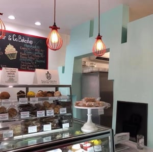
Huascar & Co. bake shop: a vivacious design for a creative chef
George Ranalli Architect
Huascar & Co. Bake Shop is the new bakery of chef Huascar Aquino in Manhattan, designed by George Ranalli Architect....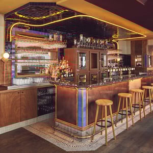
Arie: an evocative design that inspires authenticity
Studio Modijefsky
Studio Modijefsky has added a new member to its growing family of projects in the foodservice sector. After its restyling of classically classy Amster...
Bagheera, a speakeasy bar inspired by “The Jungle Book”
Bergman Design House
Bagheera, a secret speakeasy bar by Bergman Design House, enchants Vancouver with its atmosphere of luxury and adventure...


![The Plan 170 [05-2026]](https://www.theplan.it/cdn-cgi/image/width=300/images/theplan170cover.jpg)
